C++ UI framework
PrismUI
PrismUI is a from-scratch user-interface framework written in pure C++. It draws every pixel itself on the GPU, lays out a retained tree of widgets in two phases, and routes input through a tiny event-driven loop. There is no web view, no platform toolkit, no markup — a window, a font, and a theme, and the whole interface is yours.
Introduction
PrismUI was built to replace a SwiftUI shell that had grown slow and hard to control. It takes its shape from Blender: an application is an event loop over regions; a region hosts a tree of widgets; a theme turns widget state into pixels; and the platform layer is a thin, swappable boundary over the operating system. Nothing is reflective or magic — you can read the whole path from a click to a repaint in a few hundred lines.
The design has three convictions:
- The theme draws everything. Widgets hold state and geometry; they never pick a colour or a corner radius. A theme is data — swap the data and the entire UI re-skins live, with no widget recompiled. Flat, pixel-art, and an SGI-IRIX revival all ship from the same renderer.
- Layout is two passes, no constraints solver. Every widget
measures its natural size, then isarranged into the rect it's given. Containers compose: a Column of Rows of Fields is just measure-then-arrange all the way down. - The loop is event-driven, not a spin. It blocks on OS input or a worker wakeup, dispatches, drains notifiers, and repaints only what's dirty. Idle means zero GPU work.
The stack
PrismUI is three layers, each a separate library so a renderer or a game could host the lower ones without the widgets. Dependencies point in one direction only:
prismplatform is the only layer that knows the operating system. It opens windows,
pumps the native event queue into one flat Event struct, and exposes a small render
hardware interface (the “RHI”) over Metal. prismgpu is a platform-independent
immediate-mode drawer — rectangles, rounded boxes, lines, gradients, glyphs — batched onto the RHI.
prismui is everything above the pixels: the loop, the widget tree, layout, theming,
popups, shortcuts, and docking.
Architecture
At runtime an App owns a list of regions (rectangles of the window) and an
event-driven loop. Most regions are a WidgetView — a region that hosts a retained tree
of Widgets, lays it out, draws it through the theme, and routes events to it.
Dispatch order matters and is explicit. A modal popup (an open menu) gets first
refusal; then an active drag that has grabbed capture; then the global accelerator
keymap; finally the region under the cursor. A WidgetView
hit-tests down to the widget under the pointer, gives it the event, and lets it grab the mouse for
a drag or take keyboard focus.
Layout is two phases. When a view's rect changes it runs a measure
pass (each widget reports its natural size for the available width) and an arrange pass
(each widget is handed a final rect and positions its children). Heights come from the font via
measured text; nothing is hard-coded.
Drawing is retained but immediate underneath. The widget tree persists across frames, but a repaint walks it and re-issues Canvas calls — there are no per-widget GPU buffers to invalidate. The Canvas batches everything by pipeline and flushes once. The loop only repaints when a region is marked dirty, so a still UI costs nothing.
JobSystem; a worker posts to a thread-safe NotifierQueue and calls
wakeup(), which nudges the blocked loop just enough to show progress. The UI never
freezes behind a computation.
Quickstart: make a button do something
Here is the whole of a working program: open a window, put one button in it, and print when it's
clicked. The App owns the loop; a WidgetView is the region that hosts the
button; the theme paints it.
#include "prism/platform/System.h"
#include "prism/gpu/TrueTypeFont.h"
#include "prism/ui/App.h"
#include "prism/ui/WidgetView.h"
#include "prism/ui/Build.h" // the widget factories
#include "prism/ui/Themes.h"
using namespace prism;
using namespace prism::ui;
int main() {
auto sys = platform::createSystem();
auto win = sys->createWindow("Hello", 360, 200);
// A device + a font + a theme: everything the widgets draw through.
auto dev = platform::rhi::Device::fromContext(win->context());
auto font = gpu::makeTrueTypeFont(dev.get(), "/System/Library/Fonts/Helvetica.ttc",
13, win->backingScale());
auto theme = makeFlatTheme(font.get());
App app(*sys, *win);
auto view = std::make_unique<WidgetView>(theme.get(), &app);
// One button, wired to a callback — the factory builds and configures it.
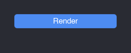
view->setRoot(button("Render", [] { std::printf("clicked!\n"); }));
// Place the view; the App calls this on every resize.
auto* v = view.get();
app.add(std::move(view));
app.setLayout([v](float w, float h) { v->rect = {0, 0, w, h}; });
app.run(); // event-driven until the window closes
}That's the entire contract: a widget holds a callback, the framework calls it on the matching
gesture. A Button fires onClick; a Slider fires
onChange(float); a Checkbox fires onChange(bool).
Quickstart: a panel with layout
Real UIs are trees of containers. A Column stacks children vertically; a
Row places them left-to-right and splits leftover width between flex children;
a Field is a labelled row with one control. You build the tree once and the two-phase
layout sizes it.
// The whole tree in one expression: containers take their children, leaves
// configure up front, flex() weights a Row child. No make_unique, no std::move.
view->setRoot(
    column(
        title("Export"),
        field("Overwrite", checkbox()),                  // a labelled checkbox
        row(flex(button("Cancel"), 1),                   // two buttons that
            flex(button("Save"),   1))));                // share the width equally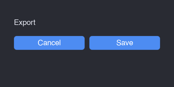
Column holding a Title and a Row of two flex buttons.The modules
prismplatform — the OS boundary
The platform layer hides every operating-system quirk behind three interfaces and one event
struct. ISystem creates windows and pumps events; IWindow is a drawable
surface with a backing scale and a Metal context; the rhi::Device abstracts GPU
resources and draw submission. Input arrives as a single flat Event — pointer,
keyboard, or window — with platform-neutral modifiers: Mod_Cmd is
Command on macOS and Super elsewhere, Mod_Alt is Option/Alt. The backend even
normalises gestures — Option+Left becomes a middle-drag, Ctrl+Left a right-click — so the UI never
sees the difference.
prismgpu — the 2D drawer
Canvas is an immediate-mode drawer over the RHI: fillRect,
fillRoundedRect (SDF-antialiased), strokeRect, line,
gradients, and drawText. It keeps a clip/scissor stack and a point→pixel scale, so
callers work in logical points and the Canvas handles Retina. Font is an interface —
a glyph atlas plus metrics — so swapping the implementation swaps the typeface; the bundled
TrueTypeFont is FreeType-backed.
prismui — the framework
The top layer is small and orthogonal:
- App
- The event-driven loop. Owns the regions, the popup stack, the notifier queue, the job system, and the global keymap.
- Region
- A rectangle of the window with
draw/handle/onNotifyand a dirty flag. - WidgetView
- A region that hosts a retained widget tree: lays it out, draws it through the theme, routes events with hit-testing, mouse capture, and keyboard focus.
- Widget
- The base of every control and container:
measure→arrange→draw→handle, plus callbacks. - Theme
- Turns widget state into pixels.
DataThemerenders any look from aThemeDatatable. - Popup
- The floating layer above the regions — menus, dropdowns, the colour picker, modal dialogs.
- KeyMap
- The accelerator layer: named actions bound to key chords, looked up by menus so the hint and the live key never drift.
- DockHost
- Tiles a window by a split tree of tabbed areas, with draggable dividers and tab drag-and-drop.
- JobSystem / NotifierQueue
- Run work off the main thread and post results back to wake the loop.
Theming — a theme is data
Widgets never name a colour. They ask the theme to draw a button face in a given state; the theme
decides everything visual. One renderer, DataTheme, draws every widget from a
ThemeData — fonts, metrics, a style mode (bevelled, rounded, square), and a palette.
Change the data and the whole interface re-skins live; .theme files are plain text you
can edit and reload.
auto flat  = ui::makeFlatTheme(font.get());                 // built-in dark-flat
auto pixel = ui::makePixelTheme(font.get());                // built-in pixel-art
auto irix  = ui::makeThemeFromFile(dev.get(), "irix.theme", scale);  // editable file

view->setTheme(flat.get());   // re-skins the live tree
Every screenshot on this page uses the built-in flat theme.
Shortcuts
Keyboard accelerators live in a KeyMap — Blender's keymap idea distilled. A
Shortcut is a physical key plus an exact modifier chord; a binding ties it to a named
action. The App offers each key press to the map after the popup and capture layers
and before the regions, so a bound chord fires from anywhere — while plain typing (no modifier)
falls through to the focused widget untouched.
app.keymap()
    .bind("edit.undo", {platform::Key::Z, platform::Mod_Cmd},
          [&] { doc.undo(); })
    .bind("edit.redo", {platform::Key::Z, platform::Mod_Cmd | platform::Mod_Shift},
          [&] { doc.redo(); });

// A menu row borrows BOTH the action and the hint from the binding,
// so the displayed "⌘Z" and the live key can never drift apart.
menu.items = { ui::MenuItem::bound(app.keymap(), "Undo", "edit.undo"),
               ui::MenuItem::bound(app.keymap(), "Redo", "edit.redo") };
Shortcut::toString() is platform-aware: it renders ⇧⌘Z on macOS, in
Apple's modifier order, and Shift+Super+Z elsewhere. Letters and digits are matched by
physical position, so a chord binds the same key whatever the active layout.
Widget reference
The toolkit covers what a property-editing application needs, modelled against Blender's vocabulary. Every widget measures to an intrinsic size, draws through the theme, and turns gestures into a callback. Below is the control set in one panel, then each group in turn.
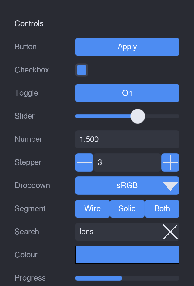
Fields.Controls
- Button / IconButton
- A momentary press;
onClick. IconButton shows an Icon instead of a label (toolbar cells). - Checkbox
- A boolean box;
onChange(bool). - Toggle / IconToggle
- A button that holds an on/off state (sunken + accented when engaged).
- Slider
- A 0..1 track with a knob;
onChange(float). - NumberField
- Blender-style: drag horizontally to scrub, or click to type a value; clamps and commits on Enter.
- Stepper
- A [−][value][+] nudger for discrete bumps.
- Dropdown
- A combo box that opens a menu of options on the popup layer;
onChange(index). - SegmentedControl / RadioGroup
- Mutually-exclusive options — a button row, or a vertical list of diamond radios.
- SearchField / TextField
- Single-line text entry; SearchField adds a magnifier and a clear affordance.
- ColorSwatch
- A colour well that opens the colour picker;
onChange(Color). - ProgressBar
- A read-only fill, 0..1 — driven by a background job.
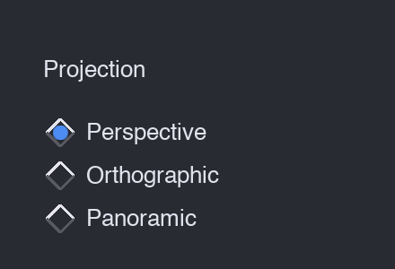
RadioGroup — the classic vertical form control.Containers & layout
Containers are widgets too — they just lay out children. Compose them freely.
- Column
- Stacks children vertically, each stretched to the content width, with theme spacing and padding.
- Row
- Left-to-right;
flex == 0children take their natural width,flex > 0children split the remainder by weight. - Grid
- Row-major across N equal columns with a uniform row height.
- Field
- A fixed-width label column on the left, one control filling the rest — the property-row primitive.
- Spacer
- Fixed empty space (or use
flexin a Row to push things apart). - ScrollView
- Wraps a taller child, clips it, and scrolls it — wheel or thumb drag, gutter only on overflow.
- CollapsiblePanel
- A titled disclosure section; collapsed, only the header is drawn and the content takes no space.
- TabWidget
- A tab strip over a content stack; only the active page is laid out.
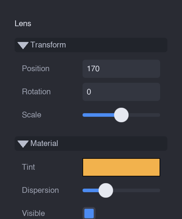
The inspector below is a Column of CollapsiblePanels, each a Column of Fields — the everyday composition:
Item views
For lists of data there are ListView (flat selectable rows of icon + label, optional
inline checkbox), TreeView (disclosure chevrons, indentation, collapsible groups,
leaf selection), and Table (a multi-column grid). All three fire onSelect
and onContextMenu.
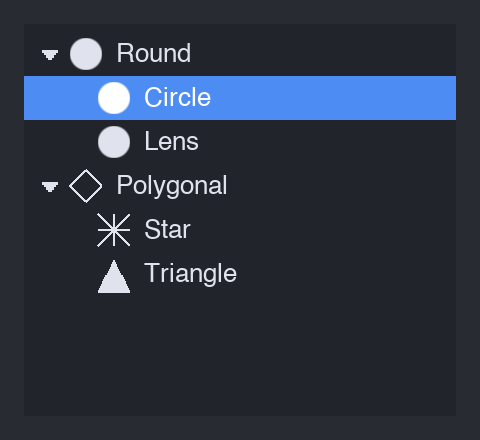
TreeView — the outliner pattern, with a selected leaf.Popups
The popup layer floats above the regions. The App owns a stack of popups; while one is
open it captures every event modally and dismisses on click-away or Esc. MenuPopup
handles context menus and dropdowns (with cascading submenus, shortcut hints, checkable rows, and a
Maya-style option box); DialogPopup is a modal confirm; ColorPickerPopup
is a saturation/value square with a hue strip.
menus, dropdowns, submenus
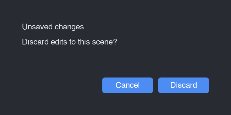
modal confirm
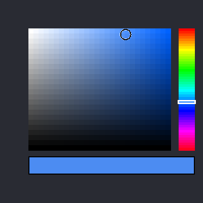
HSV picking
Docking
A DockHost tiles a window by a recursive split tree: each leaf is a tabbed area showing
one editor, splits carry an axis and child fractions, and the dividers between them drag to resize.
Tabs drag too — drop one onto another area's centre to add a tab, or onto an edge to split, with a
live drop-zone highlight. The split-tree mutation always collapses degenerate nodes, so the layout
never accumulates empty cells. Editors register by a kind string and are any Region —
a WidgetView, a custom drawing surface, anything.